Votsh Starling
Intersections are often where man finds meaning. The Votsh Starling is an intersection of a classic pocket watch with a light show. Starling is not an horological machine. Instead it is a reminder to spend time on yourself. It encourages you to look deeply into the cosmos and find your place among the stars.
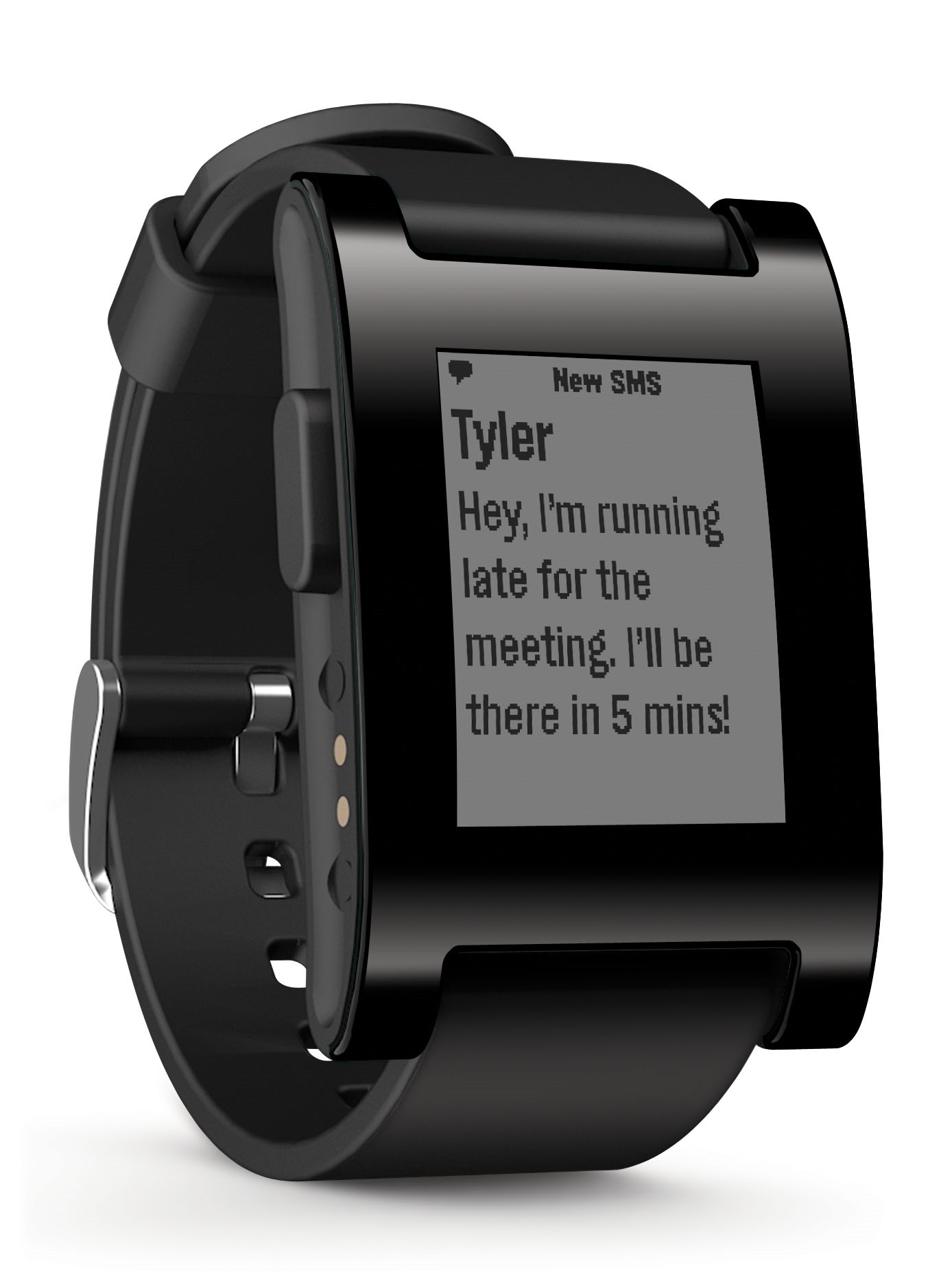
Pebble, Good for Developers/Geeks, Not Quite Ready
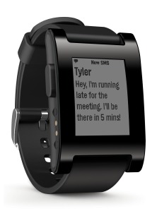
The Pebble. You’d think a watch with the Pebble’s tech specs and open forum/platform for developers would be a fantastic piece of technology. Unfortunately, I was not so amazed by the Pebble, one of the first smart-watch brands to become available to consumers. Tested with the white-banded Pebble paired to an IPhone 5; here are the good and bad attributes to the Pebble smart-watch:
The Good:
- The Pebble was one of the most comfortable and lightweight watches I have ever worn. The standard silicone band, included in purchasing the Pebble, had a very comfortable feel to it. This watch was surprisingly light weight. Considering Apple’s first IPhone weighed 4.8 ounces, the first Pebble had a surprising weight of 1.34 ounces. (Information obtained from Apple.com and GetPebble.com)
- Solid battery life. Most electronics used throughout the day need to be charged every night to be used the next day, the Pebble lasted for 4-6 days (depending on use). Additionally, the Bluetooth connection did not drain the IPhone battery as predicted.
- The function of displaying notifications on the user’s wrist was the best part of the Pebble. Texts, Emails, Facebook, Twitter, and Phone Call notifications greatly aided the user. The function of these notifications offered the greatest attribute to the Pebble, but only acted as notifications.
The Bad:
- The pebble received, but rarely sent information. Being able to view texts and other worded notifications on the wrist was great, but the Pebble failed to offer a method of response. The only information sending application to the Pebble’s initially installed software was the music controller (which was pretty damn cool).
- Four (mushy) Buttons and general appearance. Contrary to other reviews, the Pebble was not an attractive watch. While some individuals indicated interest in the technological aspects of the Pebble, the majority of others indicated the watches poor visual appearance. Additionally, the four buttons had a mushy feel and should be replaced by functions of the 3D Accelerometer.
- The $150 watch didn’t work when I opened it. There are only a few things as satisfying as taking the shrink-wrap off a new toy. Similarly, there are only a few things as annoying as opening that toy and finding it doesn’t work. Upon opening the Pebble from the shipping container (purchased online), I found myself stuck in a constant loop of charging the watch, updating the watch to the most recent software, and finding the watch crash back to recovery mode (requiring the Pebble to be updated). After spending an hour or so searching through the public forum page, I found the current fix of this bug (which MANY other people had) was to downgrade the software to the previous version. It has been 20 days now, problem hasn’t changed…
In the end, I would not suggest spending $150 on the Pebble price tag. The juvenile nature of the watch and the technology behind it indicate more time and effort is needed for the Pebble to be a good consumer electronic. That being said, I would conclude that the Pebble is a fun watch for developers to begin playing with in order to generate future ideas and functions for the upcoming decade of wearable technology.
Jack Cohen
Independent Information Technology Contractor
@MrJackCohen
JackAnthonyCohen@gmail.com
Google Glass, Good Prototype, Needs New OS
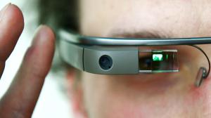
Last Summer I was selected by Google to try Glass, their prototype system to augment reality with the knowledge of the Internet. Wear Glass as you would a strange set of sun glasses or readers. Glass layers a 15 characters by 3 line display of text and graphics over your normal eye sight. I participated in the trial to prove the Appium mobile testing framework is compatible with the Glass software operating environment. Software developers will be able to use a future version of Appium to test their Glass apps for correct function.
Here are my notes on the Glass experience:
- Nice design, light weight
- The battery lasted about 3 hours of use and 10 hours stand-by
- Surprised that I can see the screen clearly without my +3.25 reading glasses
- Screen can handle 15 characters wide x 3 lines max
- As an interface/control the picture taking button and trackpad make no sense to me. It’s called Glass, not Touch.
- First thing I did after the “fitting” appointment at Google’s San Francisco office was to ask Google when the next train was leaving for San Jose. “No network connection” was the response. Worse, I could not share my iPhone’s hot spot. I needed to be on a laptop/desktop to configure Glass for networks.
- Looking up to see the screen doesn’t do it for me. I want to look through the augmented reality. Up is for menu bars that I want to forget about. Down is where the action is happening, usually.
- I am looking for a personal assistant, more than a new screen for my Android or iPhone.
While Glass is a fine prototype, its design seems to be too rooted to the Android operating system. Android was built for mobile phone devices. Android does well for making phone calls, and secondarily for playing games. For example, Android introduced many of us to gestures on a touch screen device, including pinching to make something bigger or smaller.
Glass is all about augementing the real world with helpful information. It’s inputs should include:
- Hearing my voice, including noticing if I am upset, calm, or panicked
- My body position, including noticing if I am standing up, sitting down, croutching, or running, and which way I am heading. It should also know how to ignore the things behind me and anticipate was is coming in front of me.
- My attention, including where the pupils of my eyes are looking
- 3 dimensional modeling of the things I am seeing. If I see a lovely necklace I should be able to view it in Glass, have Glass model it into a 3D file, and print it with a 3D printing service. Consider the first commerical 3D scanner.
Glass shows the need for a new operating environment for real-time augmented reality. While Glass is a good first prototype, there is a lot more that can be invented.
The experience with Glass got me thinking about the requirements for a good watch operating environment.
-Frank
Being Power Efficient and Present To The Wearer
Research into electronic watches has been really fun. If you want to blow your mind try http://www.tokyoflash.com. Zooming around the Web I found a $6 watch with an unusual display.
Press the button and the watch displays the time in three bands of tiny round dots.
I have an issue with this design. Sometimes I need to know the time and my hands are not free to press the button. For example, when I am riding an electric scooter at high speed and I am late to catch the train to work.
Electric watches conserve their battery power by turning themselves off when they think they are not in use. I initially chose an ePaper display for Votsh partially because it requires no energy between updates. There needs to be a way to be power efficient and present to the wearer.
The solution is a simple algorithm for when the watch uses or updates the display. I learned this from Ethernet networking protocols. Here is how it works:
1) Set a timer interval value of 1 second.
2) Count down the timer interval value time, then update the display.
3) If the user has not triggered any action during the interval, then double the time interval value and go back to step 2
4) Wake-up and resume normal operation
The user’s “trigger” can be anything: pressing a button on the watch, touching/gesturing on the watch face, shaking the watch, the watch receives a message over a network, etc.
What do you think? Click comments and let me know.
-Frank Cohen

